
Nowadays, small business is all about responsive website builders. It’s easy to understand why people still love them because they offer flexibility, adaptability, and next-level user-friendliness.
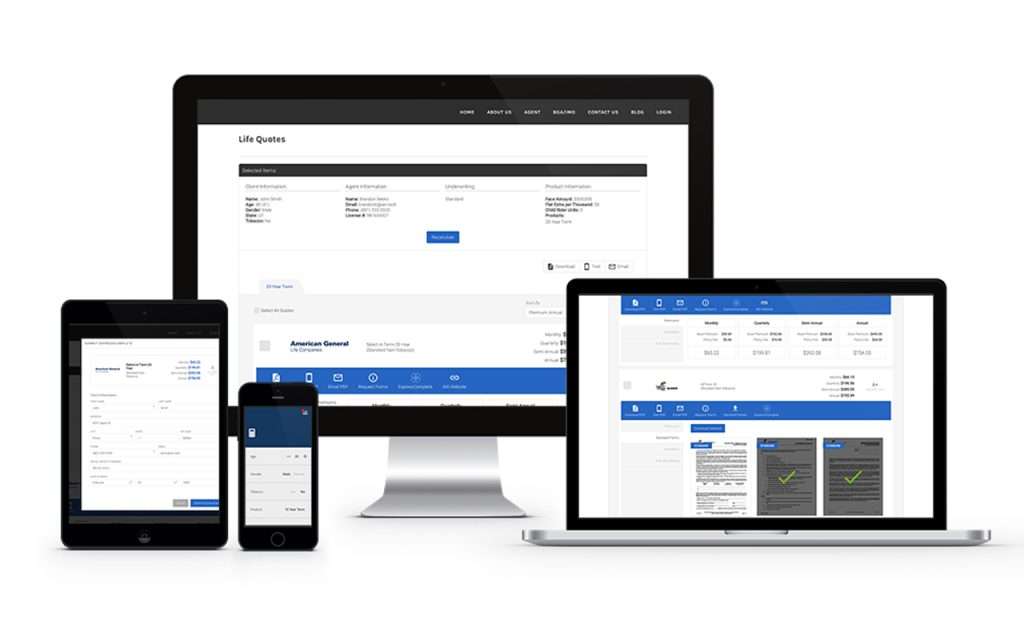
A responsive website combines the features of a mobile and desktop edition. However, they are not equivalent to those kinds of websites. Below, we’ll make a distinction between responsive and mobile websites. Additionally, we’ll delve further into the function of responsive website-building tools.
Small business owners may begin to feel pretty good about these tools once they have a better understanding of what they are and what they accomplish, and they should! There are numerous advantages to choosing a responsive website builder that we can all appreciate. By the end of this article, you’ll recognize what I’m talking about.
What is the difference between a Responsive Website and a Mobile website?
It’s common to use the words “responsive” and “mobile” synonymously. Because of the similarity between responsive and mobile websites, it’s understandable that some people get them mixed up. For a while, let’s separate these two to obtain some understanding.
Responsive website
A responsive website is one approach to website design that claims that depending on screen size, platform, and orientation, design. Also, the development should adjust to the person’s perception and environment. The technique combines flexible grids and layouts, graphics, and a smart application of CSS media queries. The website should constantly change to account for resolution, image size, and scripting capabilities as the user moves from their laptop to their iPad.
Mobile Website
Mobile websites differ differently from responsive websites in that their primary design aim is to be mobile-friendly. The reader’s text may need to be minimized, graphics may need to be optimized so that small print is available on mobile devices, and information may need to load quickly.
To explain, mobile-friendly websites have static content and are developed to function precisely the same on all devices. The data on a responsive website is dynamic and ever-changing. In contrast to responsive design, which means that the images are optimized and the navigation is compressed. A mobile-friendly website has simplified navigation and smaller images.
What is a responsive website builder?
A responsive website builder is a program that anyone can use to develop their own responsive website. Typically, building a website requires extensive coding expertise and technical knowledge. Since they have advanced over the past five years. Responsive website builders have made it simple for anyone with computer skills to build a website without the need for coding expertise.
You don’t need to be a website designer to have experience with picture editing, image resizing, or designing a mobile-friendly version of your website. This kind of website builder seems to deal with the requirement for a mobile version of your site. It recognizes the text, graphics, and navigation bar to better fit a smaller screen.
Here is a sample of what our website will perform and show differently depending on how you browse it:
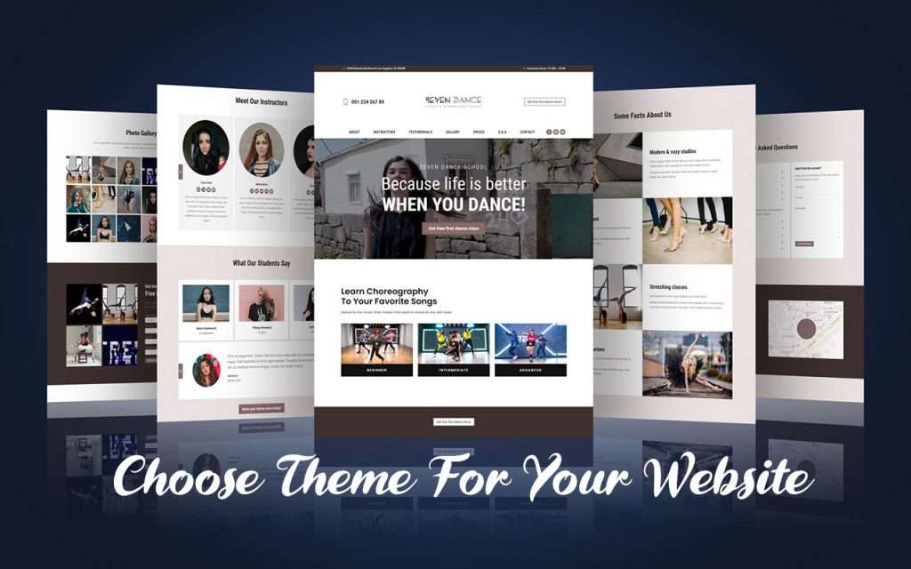
The simple drag-and-drop feature used by responsive website builders makes it simple for small business owners to build and maintain a website. Additionally, a lot of website builders include upper-edge templates to speed up design and direct content generation. By assuring the formats are updated and trying to be standard and in accordance with the needs of your visitors. Templates provide you with a rapid and trustworthy method for building a website. The selection of templates within our responsive website’s builder is shown below:
After selecting your website’s theme, continue through the builder’s instructions until your responsive site is created! You may relax knowing that the site is responsive to all devices and sizes, regardless of how it turns out.
The benefits of a responsive website builder
You, your company, and even your clients can benefit by choosing a responsive website builder!
Speed of implementation
Instead of taking months, as is frequently the case with custom-coded websites, responsive website builders allow for the development of a website in a matter of days or hours. Builders offer a quick fix for anyone trying to create their own website without having to rely on technical knowledge. You won’t have to worry about skipping a step or being confused about what to do next. Because this kind of builder usually leads you through each stage of the process.
Reduced cost
Small businesses can find it very expensive to build separate mobile websites. By preferring a responsive website, you may have a website that works on all devices. By using the highest accuracy templates, you can significantly reduce the cost of developing and designing a premium custom website. Even though some builders offer to be free. They might not actually provide the ideal experience for the builder (you) and your clients. Free responsive website builders should be avoided.
Easy updates
Developing modifications to your website is simple and clear if you’re using a website builder application because you won’t have to pay a developer to do it for you. Additionally, you may quickly add or modify content to your website using a responsive website builder. You can easily change the text by clicking and replacing the existing text.
SEO Benefits
Responsive websites check that box for you just because they adjust to mobile formats. At the very least, having a responsive website ensures that your site won’t suffer in search results because Google prefers mobile-friendly sites.
As we’ve already shown, it’s simple to maintain the content of your website. Google appreciates quality material when it comes to SEO. Therefore, business owners can provide Google with a good signal that their site is up-to-date by adding high-quality information pages or by posting fresh, in-depth blog articles.
The final thing I’ll say about SEO and responsive design is that the goal is for the site to be adaptable to various screen sizes and formats. That indicates loading the ideal size of a picture, etc. This may improve website speed. Now guess what? Google loves websites that are speedy.
User experience
By using a responsive website builder, you can be sure that key elements that affect the user experience, such as website navigation, are set properly so that visitors can easily locate what they’re looking for.
Menu options on non-mobile websites sometimes become difficult to read on mobile devices. Additionally, a responsive builder will remove images that are unworkable on mobile devices, allowing you to expose hidden features that impact the mobile user experience.

In the end, providing easy navigation increases the probability that consumers will do business with you because they can discover what they require rapidly and effortlessly
Why you need a responsive website
Offering a responsive experience on your website is more important today than ever, considering 57% of all U.S. online traffic now occurs from mobile devices and tablets, according to a 2017 report. Considering that an increasing number of people are viewing websites on mobile devices, select a responsive website builder that also provides excellent functionality.
By doing this, you can make sure that your website can manage users with different screen sizes, devices, and operating systems, which improves the total user experience while visiting your website. When they enter, visitors will not be required to zoom in on tiny text or see broken pictures, giving them the impression that your company is out of date.
You can update your website very quickly and cost-effectively when you have a responsive website.
Additionally, it assists in increasing search rankings together. In the search results of 2018, Google gives preference to sites that are mobile-friendly, and Google advises businesses of all sizes to build a site that is mobile-friendly and employs responsive website design.
It’s more probable than ever that your audience will discover your company online for the first time when it comes to communicating with them as an SMB. This indicates that it is now appropriate to switch to using a responsive website to ensure your consumers have the best quality user experience from the very beginning.

Leave a Reply